The Importance of Typography in Brand Design: Breathing Life Into The Static
Sep 25, 2024
Sep 25, 2024
Sep 25, 2024
Sep 25, 2024
-
6 minutes
6 minutes
6 minutes
6 minutes

When we think about brand design, the first things that typically come to mind are logos, color schemes, or even the overall aesthetic. But there’s one element that often gets overlooked, and it’s arguably one of the most important pieces of the puzzle—typography.
Fonts are the personality of a brand. They take something static and breathe life into it, giving your brand a voice and tone before a single word is even read. Think of fonts like a wardrobe; the right combination can either dress your brand for success or send the wrong message entirely.
The Personality Behind the Typeface
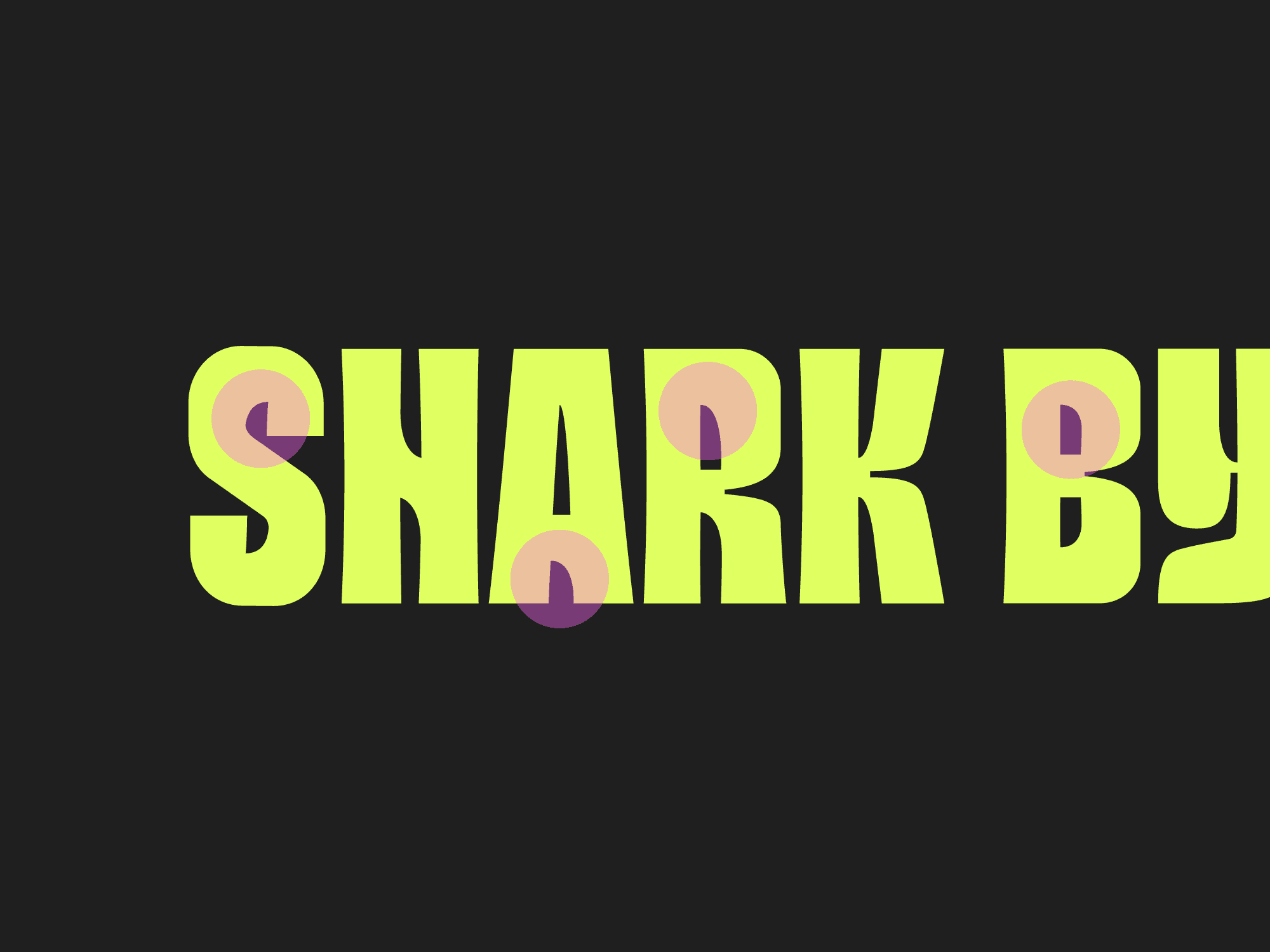
A font isn’t just a collection of letters. It’s how those letters feel when you look at them. They set the stage for the emotions and associations your audience will make with your brand. Is your brand playful? Sleek? Bold? Sophisticated? The font choices you make communicate these qualities instantly.
For example, a serif font might lend an air of tradition and authority, while a sans-serif typeface can feel modern, approachable, or even minimalist. Choosing the right font is like choosing the right tone of voice for a conversation—it should be in tune with the message you're trying to send.
Font Pairing: The Art of Visual Harmony
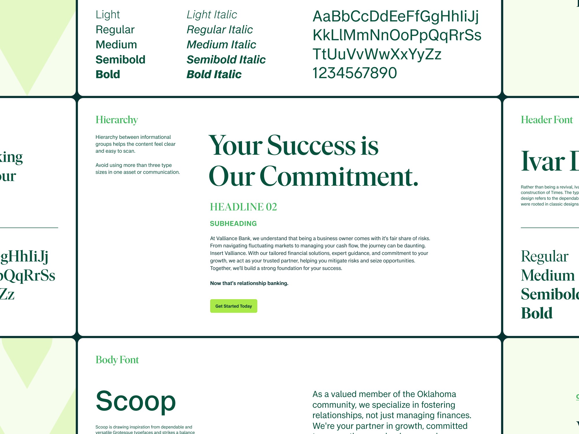
Font pairing is where things get fun, and a little tricky. The balance between your primary and secondary fonts can either create harmony or chaos within your design. Just like you wouldn’t pair clashing colors, mismatched fonts can make a brand feel disjointed or confusing. When done right, however, a good font pairing elevates the design, giving different types of content the right emphasis while maintaining a cohesive look and feel.
A bold, attention-grabbing headline font might need a simpler, cleaner typeface for body text to avoid overwhelming the viewer. The key is contrast and balance—two fonts that complement each other while offering enough difference to highlight their respective roles.
Breathing Life Into a Brand
Typography is one of the most subtle but powerful tools in brand design. It’s the element that can take a flat, uninspired design and give it depth, emotion, and personality. Fonts can evoke nostalgia, create trust, or even inspire action—all before the audience reads a word.
So, whether you’re building a brand from scratch or giving an existing one a facelift, don’t underestimate the power of typography. The fonts you choose will speak volumes, quietly setting the tone and shaping perceptions before anything else does.
Remember, fonts aren’t just letters—they’re how your brand speaks without saying a word.


